Begin with the light, not a paint chart
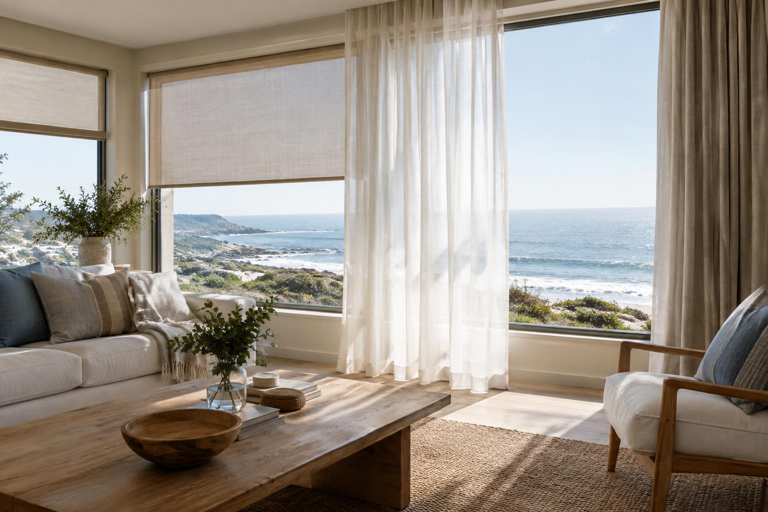
Coastal decorating often starts with an image: a pale wall, a sandy floor and a glimpse of blue. That image can be useful inspiration, but the same colours may feel quite different in your own home. A shaded living room, a bright veranda and a bedroom with afternoon sun each need a slightly different approach. Before choosing paint or fabric, spend a day noticing where light enters, how long it lasts and which corners remain dim.
In South African homes, a north-facing room may receive generous sun, while an overhang, neighbouring building or deep veranda can change the effect considerably. Watch the room in the morning, around midday and late in the afternoon. Also notice what sits outside the window: greenery, paving, a painted boundary wall or a view of the sea can influence how you perceive colour indoors. Your goal is not to calculate the perfect shade, but to understand what the room gives you to work with.
Choose a quiet base that suits the room
A coastal palette benefits from a steady background. Warm off-white, soft stone, pale sand and muted putty are all alternatives to stark white. In a room that feels cool or shadowed, a neutral with a little warmth can make the space feel welcoming without turning it yellow. Where sunlight is strong, a softer, slightly muted base may be easier to live with than a brilliant white that appears glaring at midday.
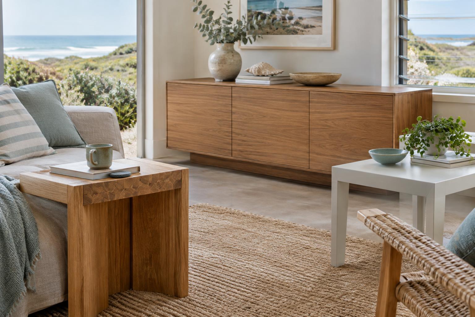
Consider the surfaces that will stay. Timber floors, terracotta tiles, stone counters and large pieces of furniture already contribute colour. Rather than trying to match them exactly, look for a base that lets them sit comfortably together. If your floor has warm tones, for example, an icy grey wall may create a sharper contrast than you intended. A calm base gives you room to bring in coastal character through smaller choices.
Let coastal accents come from more than blue
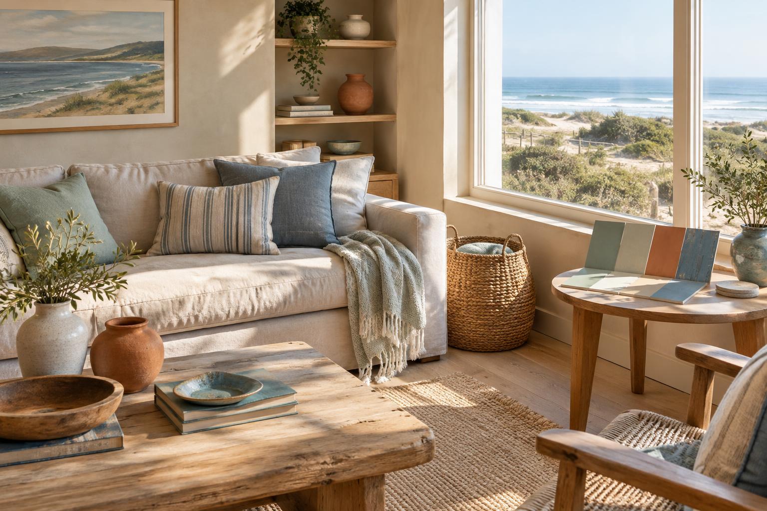
Blue is an obvious link to the coast, but it is not the only one. Dune grass, weathered timber, sea-worn stone and leafy courtyards suggest olive, clay, oatmeal and soft charcoal. These colours can feel particularly grounded when used alongside woven textures and natural wood. If you love blue, consider a muted sea-glass or deep ink tone rather than assuming every coastal room needs a bright aqua.
Keep the main palette limited enough to feel restful: one background colour, one or two supporting colours and a small accent are often plenty. In a sunlit room, a darker cushion, painted cabinet or framed artwork can add definition. In a dimmer room, lighter textiles and a few well-placed accents may preserve the sense of openness. Repeat an accent in two or three places so it feels deliberate, but leave space for the room to breathe.
Test colours where you will actually see them
A paint chip held under shop lighting cannot show you how a colour will behave at home. Make generous sample patches on more than one wall, or paint movable sample boards that you can place beside the floor, curtains and furniture. Check them at different times of day and with your usual lamps switched on at night. A white that looks fresh in morning light might seem grey in the evening; a beige that looks gentle in shade might turn stronger in direct sun.
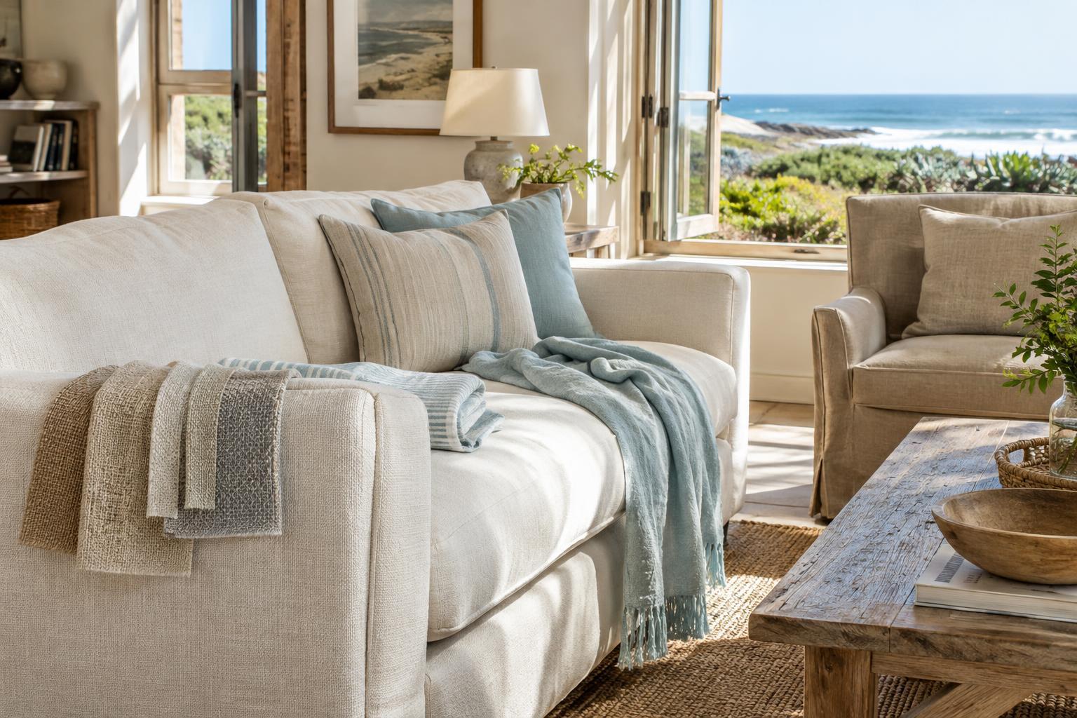
Test fabrics and finishes in the same way. A linen-look curtain can soften bright light, while a glossy surface may reflect it more sharply. If a sample seems wrong, try to identify why before searching for another colour: is it too cool beside the floor, too saturated in the sun or too similar to the sofa? That observation will make the next choice easier.
Build a palette you can live with
A successful coastal room should suit ordinary days as well as sunny ones. Think about how the palette looks when the weather is overcast, when the lamps are on and when beach bags or everyday belongings are in view. Washable textiles, practical rugs and easy-to-refresh accents can be more useful than a perfectly styled arrangement that is difficult to maintain.
You do not need to redecorate everything at once. Start with the largest surface that feels out of place, then add colour through items you can move or replace. A coastal palette works best when it responds to the home around it: the quality of its light, the materials already there and the way you use each room. The result can feel connected to the shoreline without looking like a themed beach house.